Main Menu
You can use the tools here to add a custom Menu Bar to your publication. The Menu Bar is a standard Windows component which appears at the top of many applications. Unless your publication already contains a menu, the Menu Designer Screen will be empty. Along the right side of the screen are four small buttons that can be used to add or remove items from your menu.
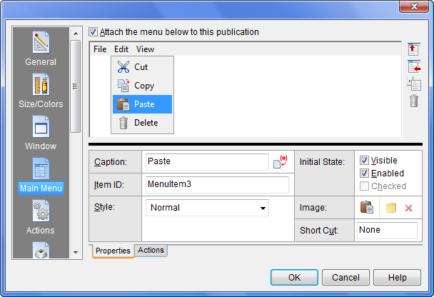
Items added to the menu will appear in the top portion of the Designer screen, and properties for the selected item in the lower portion. The tabs at the bottom of the Designer can be used to switch between the item’s properties and its assigned Action commands. Assigned actions will be executed at runtime whenever the reader selects that menu item. The menu is organized in a hierarchical structure with top level heading items across the top and sub items under each heading.
To create a menu, start by adding one or more top level headings. For example, VisualNEO Win’s menu includes the following menu headings: File, Edit, Arrange, View, Page, App, Options, Tools, Window and Help. Of course, your menu headings will be different depending on what your publication does.
To add a menu heading, click the Add Menu Heading button  . VisualNEO Win will automatically assign the new heading a generic name like “MenuHeading1”. Click the Caption property field and replace this with your own text. The Item ID property is used by VisualNEO Win to identify this menu heading. You can leave the ID as “MenuHeading1” or change it to something more descriptive, as long as no two menu items have the same name. Only the caption will be visible to readers of your publication.
To add an item below a heading, make sure the heading is highlighted and click the Add Menu Item button  . A small box will appear below the heading. VisualNEO Win will assign the new item a generic name like “MenuItem1”. As described above, the Caption and Item ID properties can be edited to replace “MenuItem1” with your own text.
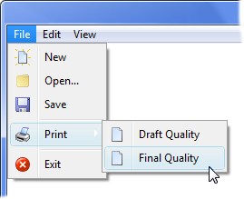
You can create sub-menus by selecting a menu item and clicking the Create Sub-menu button  . The picture below shows an example of a sub-menu:
With items and sub-items, you also have the option of selecting one of the following Style properties:
|
Normal |
A standard menu item. |
|
Check Box |
A menu item that can be either checked or unchecked. When checked, a small check mark appears next to the item’s text. |
|
Divider |
The item is a divider used to separate groups of items. |
You also can specify whether headings and items are initially Visible, Enabled and (for Check Box items) Checked. All of these settings can be changed later while the publication is running using the ShowMenuItem, HideMenuItem, DisableMenuItem and EnableMenuItem actions.
An optional Short Cut key can be assigned to menu headings and items. When your publication is running, pressing the Short Cut key has the same affect as clicking the Menu Item - any Action commands assigned to the item will be executed.
When the Check Box style if selected, a Variable property is available for keeping track of the item’s checked state while the publication is running. This Variable’s name initially matches the Item ID, but can be changed if needed. When your publication is running, you can use the If Action to examine the variable and determine whether the menu item is checked or not. For example:
If "[MenuItem1]" "=" "Checked"
AlertBox "Whoopee" "The item IS checked."
Else
AlertBox "Boo Hoo" "The item is NOT checked."
EndIf
You can optionally add a small Image (sometimes called a glyph) to menu items. Click the  button to add or replace an image. Click the
  button to remove an image. For best results, your menu images should all be the same size. Smaller images (20 x 20 pixels) work best, but menu images can be as large as 64 x 64 pixels. Transparent PNG images are recommended, but any image format supported by VisualNEO Win can be used. When importing non-transparent images, VisualNEO Win will prompt you to select a color to serve as the transparent portion of the image. (The menu’s background will show through pixels in the image matching this color.)
Note: When assigning a image to a menu item that has been designated a check box, the image will only appear when the item is checked. The image replaces the default Windows check mark graphic.
Finally, you can define special actions to be taken whenever the reader clicks a Menu Item or Heading. Clicking on the Actions tab below the menu properties will display the Action Editor and any commands assigned to the selected menu item.
Action commands may be typed directly into the editor, but most authors prefer to use the Insert Action button instead. Clicking the Insert Action button will display a list of available commands. The commands are organized into groups. Locate and click the title of the command you want. For most commands, VisualNEO Win will display a simple form that can be filled in to complete the Action. See Understanding Actions and Variables and Action Command Reference for a complete discussion of the Action Editor and Action Commands.
Note: Although it’s unusual to assign actions to headings, advanced users may find it useful in certain situations. However, doing so may have unintended side effects, as these actions will be executed anytime an item below the heading is selected.