Track Bar Tool
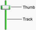
 Track Bars, or sliders as they are sometimes called, allow readers to easily select a numeric value within a minimum and maximum range. A Track Bar is similar to your stereo’s volume control. The volume control limits your choices to values preselected by the stereo manufacturer. Readers can adjust the Track Bar by grabbing the thumb button with the mouse and dragging it to a new location along the track. As the thumb button moves, the variable assigned to the Track Bar will be updated with the current position on the track. The position or value can be used in calculations, written to a file, etc.
To create a Track Bar, use the mouse to draw a rectangle where you would like the object to appear. The Track bar Properties screen will be displayed, allowing you to define the object’s appearance and behavior.
The Track Bar Properties screen is divided into three sections indicated by the icon images on the left: General, Appearance and Actions. To view the settings for a section, click the corresponding icon.
General
In the Minimum value and Maximum value fields, enter the lowest and highest values to define the Track Bar’s range. The minimum value must be less than the maximum value. The Track Bar will be initialized to the specified Initial value when your publication starts. The initial value must be within the minimum and maximum range.
In order to keep track of the position of the Track Bar while your publication is running, you will need to assign the object a unique variable name. VisualNEO Win will assign a variable name that matches the Object Name, but you may change this by modifying the Variable (to store track bar value) field. At runtime, the variable will contain the value of the Track Bar. You can modify the value of the Track Bar programmatically by manipulating the variable using a simple Action command. For example:
SetVar "[TrackBar1]" "50"
Hint: You can provide readers with additional feedback by placing a Simple Text object next to the Track Bar. Add the Track Bar’s variable ([TrackBar1]) to the Text object and the text will update whenever the thumb button is moved.
Appearance
The Track Bar’s orientation may be set to Horizontal (left to right) or Vertical (top to bottom). The Preview on the right shows you how your changes affect the appearance of the Track Bar.
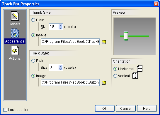
Both the Thumb Style and Track Style options allow you to choose between plain rectangular features and custom images for your Track Bar’s components. The two components that comprise the Track Bar are the moveable thumb and the track that the thumb travels across.
If you choose to use custom images, they should be drawn to the exact sizes that you need. Also, the orientation of the images and the Track bar should be the same.
Actions
Track Bars support the following Action Events: Value Changed, Value Changing, Mouse Enter and Mouse Exit. Click the appropriate tab at the bottom of the Action Editor to create or edit Actions for the events you want to control. See Understanding Actions and Variables and Action Command Reference for a complete discussion of the Action Editor and Action Commands.