Push Button Tool
 Push Buttons are probably the simplest and most easily understood method for readers to interact with your publications. Just about anyone who’s ever used a computer or an airport kiosk will immediately know how to use one. Push Buttons can be used to navigate between pages, perform calculations, display messages, send email and perform a variety of other tasks.
To create a Push Button, use the mouse to draw a rectangle where you would like the button to appear. The Push Button Properties screen will be displayed allowing you to define the button’s appearance and behavior.
The Push Button Properties screen is divided into three sections, indicated by the icon images on the left: General, Appearance and Actions. To view the settings for a section, click the corresponding icon.
General
Text entered into the Caption field will appear inside your button. Helpful caption’s generally indicate to the reader what will happen when the button is clicked. You may leave this field blank if your button does not require a caption.

You may set the alignment for the button’s text using one of the three Alignment buttons: Left Aligned, Centered or Right Aligned. If the button contains an image (see Appearance below), it will be aligned using the method chosen here.
Appearance
In addition to text, Push Buttons may contain small images or icons to represent each of the button’s three states: Up, Down and Highlight (mouse over). Interesting effects can be created by using slightly different versions of the same image for each state.
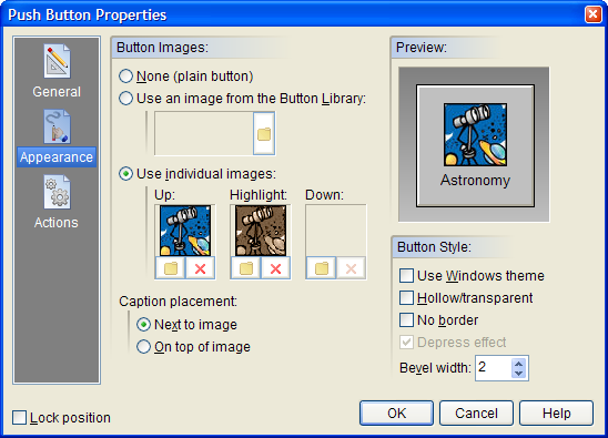
Under Button Images, select None to create a simple, plain, text-only button. Selecting Use an image from the Button Library allows you to choose from a list of special pre-made files containing images for all three button states. The Use individual images option allows you to select separate image files for each of the button states. You can use your favorite paint program to create your own custom button images. When importing individual images, VisualNEO Win will prompt you to select a color to serve as the transparent portion of the image. (The button’s background will show through pixels in the image matching this color.) By default, VisualNEO Win will use the color of the pixel in the lower left corner of the image, but you may select another color if you like.
If your button contains both text and images, you may choose to place the caption Next to image or On top of image.
The Preview window on the right side of the screen will be updated to reflect how the button will look using the appearance settings you select. Move the mouse pointer over the preview to see the Highlight image or click the preview to see the Down image.
Enabling the Use Windows theme option will display the button using the Windows XP/Vista style. This feature only works when your publication is viewed under Windows XP and Vista. When viewed under older versions of Windows, the button will be drawn using the normal method.
Enable the Hollow/transparent option to set the button’s Fill Style to Hollow. When this option is enabled, the button will appear to be transparent, allowing objects underneath to show through. Click the No border option to create a button that does not have a border outline.
Hint: Both the Fill Style and Border also can be changed using the controls on VisualNEO Win’s Style Palette.
You may specify a Bevel width for the button’s three-dimensional border. The default setting is 2, but you may change this to any number between 0 and 10 pixels. The Preview window will show the results of changes made to this setting.
The Depress effect option causes the button image or text to shift to the right and down one pixel when the button is clicked. This option is only available when Bevel Width is set to zero and Button Images is set to None or Use individual images.
Hint: You can create an invisible Hot Spot by setting the button’s Fill Pattern to “H” (Hollow) and the Line Width to “None.” To create an irregular shaped hotspot, see the Polygon/Hotspot object.
Actions
Push Buttons support the following Action Events: Click, Right Click, Mouse Enter and Mouse Exit. Click the appropriate tab at the bottom of the Action Editor to create or edit Actions for the events you want to control. See Understanding Actions and Variables and Action Command Reference for a complete discussion of the Action Editor and Action Commands.